Fiat Logo
Meaning and History
Dating back to 1899, Fiat boasts a longer
history than most European, US and Japanese rivals and is proud of taking a
huge role in developing the entire automotive industry. Few daredevils were
able to challenge the automotive field at the dawn of Italian
industrialization. However, despite all obstacles Fiat found the way to rapid
development far beyond auto production. Today Fiat is one of the most
recognizable car manufacturing companies in the world, offering stylish and
economic vehicles in different segments following historical traditions.
The company’s logo is also one of the most
recognizable badges not only in Europe but also on the US auto market. It has
evolved since it was first introduced and the latest update came in 2006 to
shape it the way we know it.
The first Fiat logo consisted of alphabets
F-I-A-T. There was an inscribed silver line between every separate letter
located on the blue background. The idea to introduce those silver lines was
initiated by the chief Fiat designer. He once saw big FIAT letters on the
factory building and decided to modify the badge with the spaces inside the
logo to make it more stylish and eye-catching. Later these letters had various
versions throughout the whole history of the Italian Car Brand. And only in
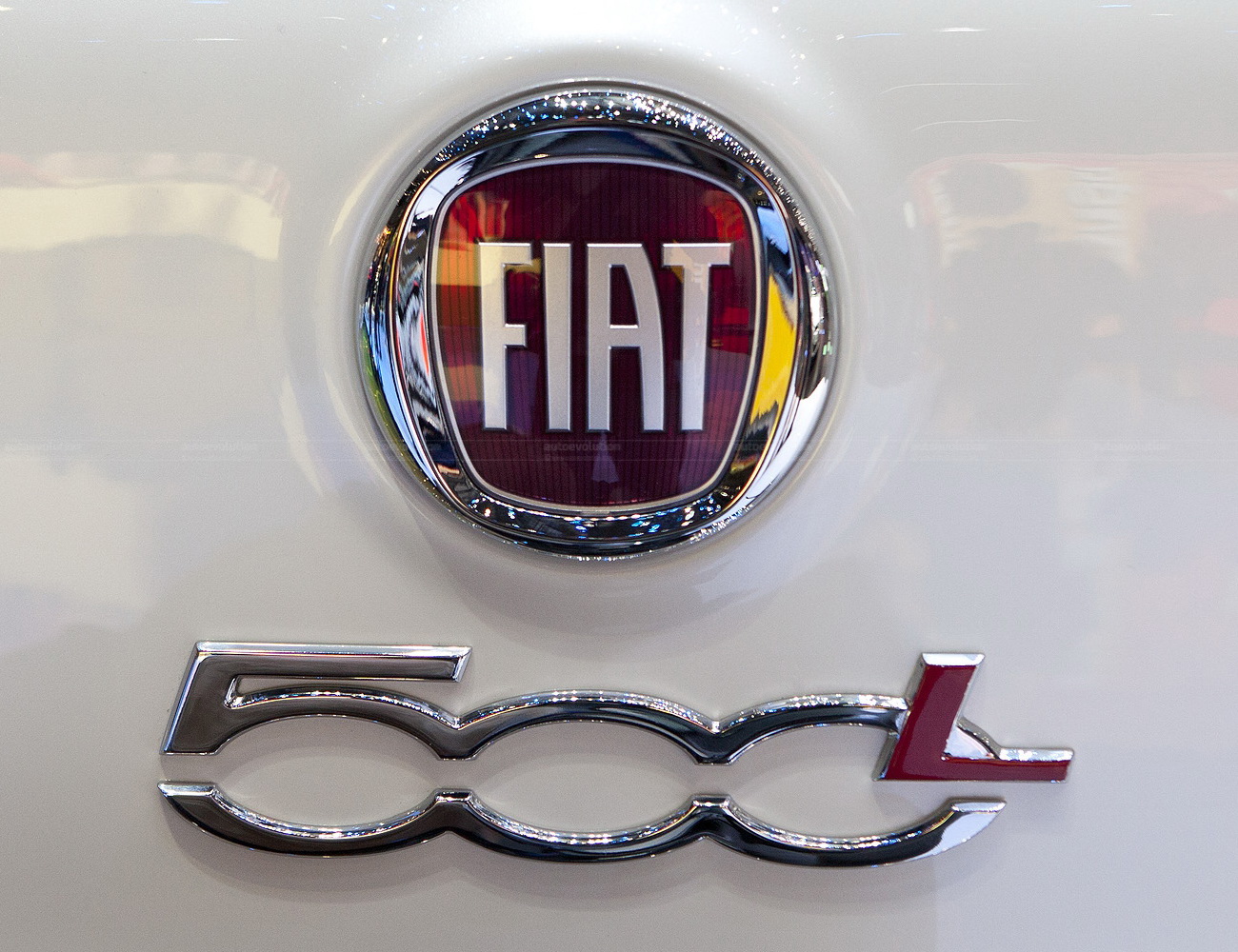
2006 it received the world’s famous circle with same old FIAT letters inside on
red background.
Logo
Description
Fiat brand does not call for additional
introduction. At the moment the Italian automaker is one of the biggest
European names on US automotive arena. At the same time it has numerous
factories all over the globe as well as thousands of employees, designers and
engineers who are working on producing innovative and modern vehicles for all
tastes. The brand has changed its logo several times starting from the first
version introduced at the beginning of the 20th century.
It depicted bold letters FIAT on blue
background which stood for Fabbrica Italiana di Automobili Torino. In 2006
designers decided to replace blue background with red one featuring the same
letters on it. Now Fiat logo has a shield-like shape with the message of
ongoing change, with the company’s name surrounded by laurel leaves.
Shape of
the Fiat Emblem
The shape of the Fiat Symbol looks like a
shield. It used to be a circle before 2006 modification. The shield contains a
message inside of it as well as the brand’s name with laurel leaves which
surround the composition.
Colour of
the Fiat Symbol
At first the symbol was mainly blue. It
consisted of large FIAT letters which stood for Fabbrica Italiana di Automobili
Torino on blue background. But the chief designer decided to make it more
stylish and remarkable adding empty spaces inside the letters and silver lines
between them. Several changes have been made since then, but the blue
background was used through 2006. It was then that the company decided to
replace it with red colour and change the shape of the badge to make it look
more modern and up-to-date.
No comments:
Post a Comment