Chevy Logo
Meaning and History
Chevrolet vehicles have been associated with
the famous bowtie emblem since 1914, which makes it one of the longest-standing
logos in the world. But how did it originate?
The first Chevrolet cars bore a rather simple
signature of the founder, Louis Chevrolet. However, the company was looking for
an eye-catching emblem that would propel the brand to success and it didn’t
take them long to introduce the cross-like bowtie logo. However, there is no
single confirmed theory explaining the origin of the emblem.
According to the company’s co-founder,
William C. Durant, he found inspiration in a wallpaper design while staying at
a Parisian hotel.
Yet, his family members disapproved of this
theory as his daughter stated that Durant had designed a sketch of the logo
while having a family dinner. His widow suggested he had found an attractive
logo in a newspaper back in 1912 while being on holiday in Virginia. That logo,
shaped as a bowtie, was the base for Chevrolet sign. The original newspaper was
never found to prove this theory though.
Another version relates the iconic logo to
the national roots of Louis Chevrolet. He was born to French parents in
Switzerland and might have taken inspiration from the Swiss flag to create his
own cross-like emblem. Anyway, the iconic Chevrolet logo was introduced in 1914
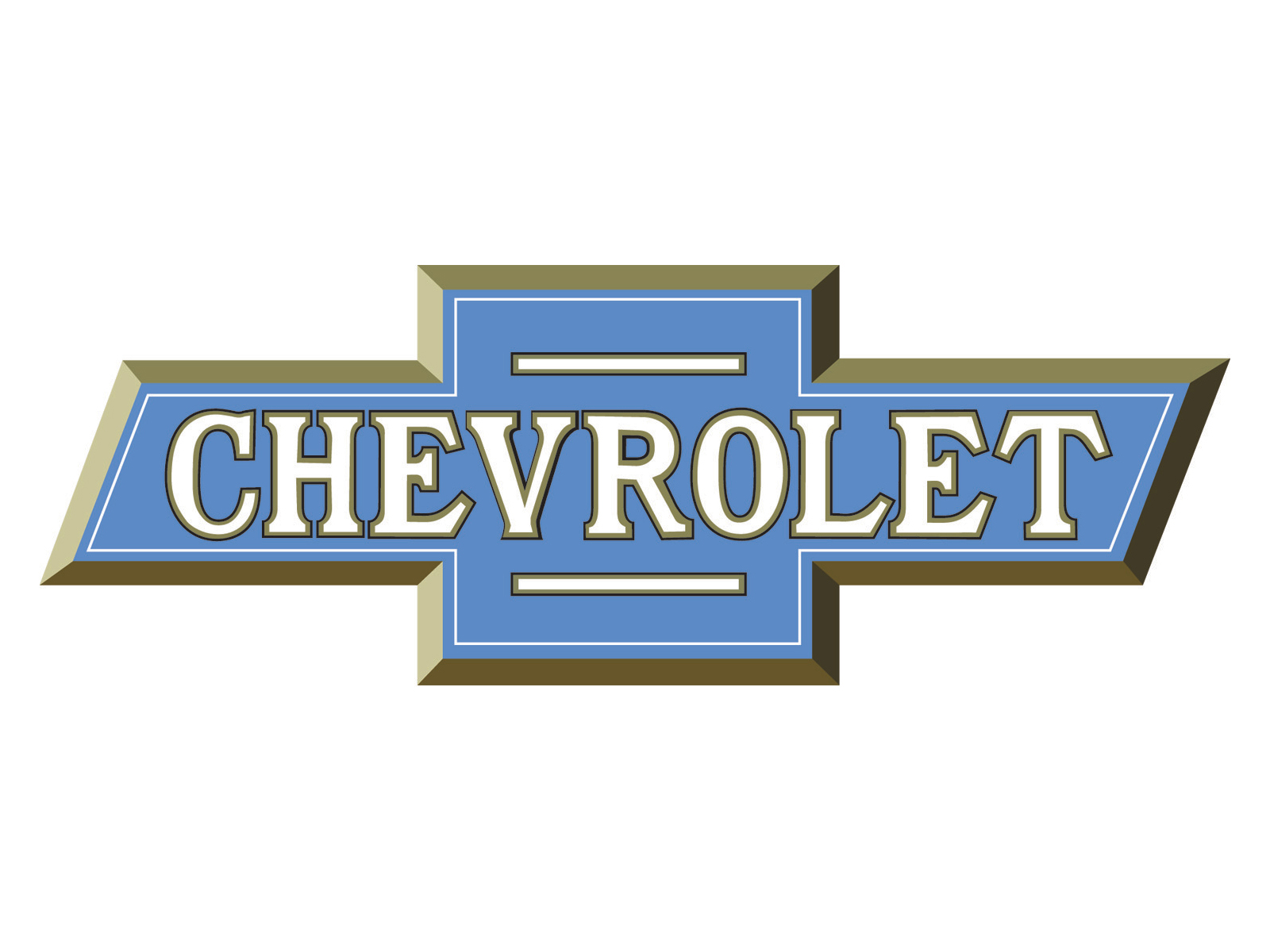
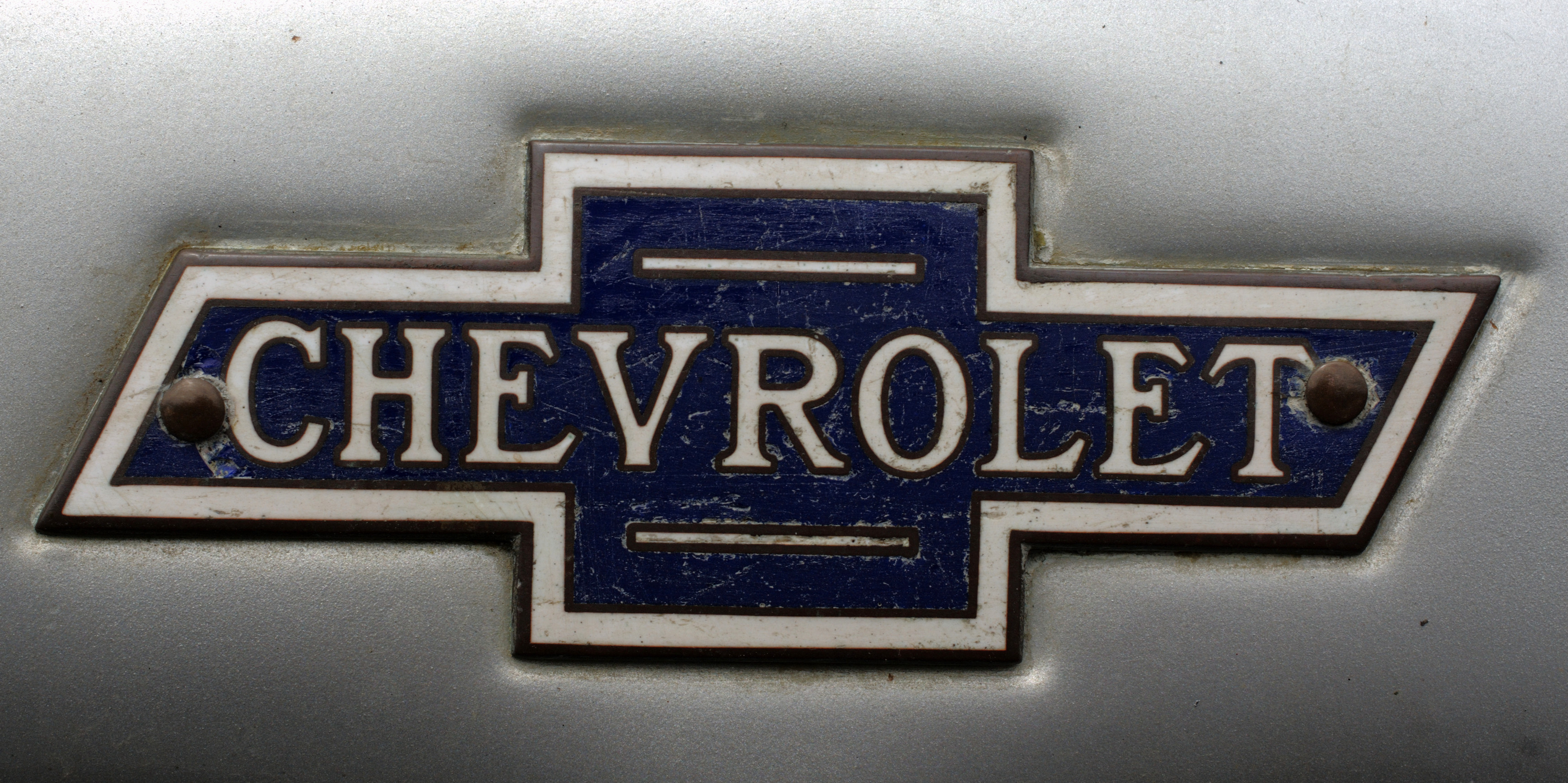
and has never left the American sports car vehicles since then. Through late
1970s it was designed in black and white colours and bore Chevrolet name
inside. The logo was painted blue in 1978 but held on to the inscription till
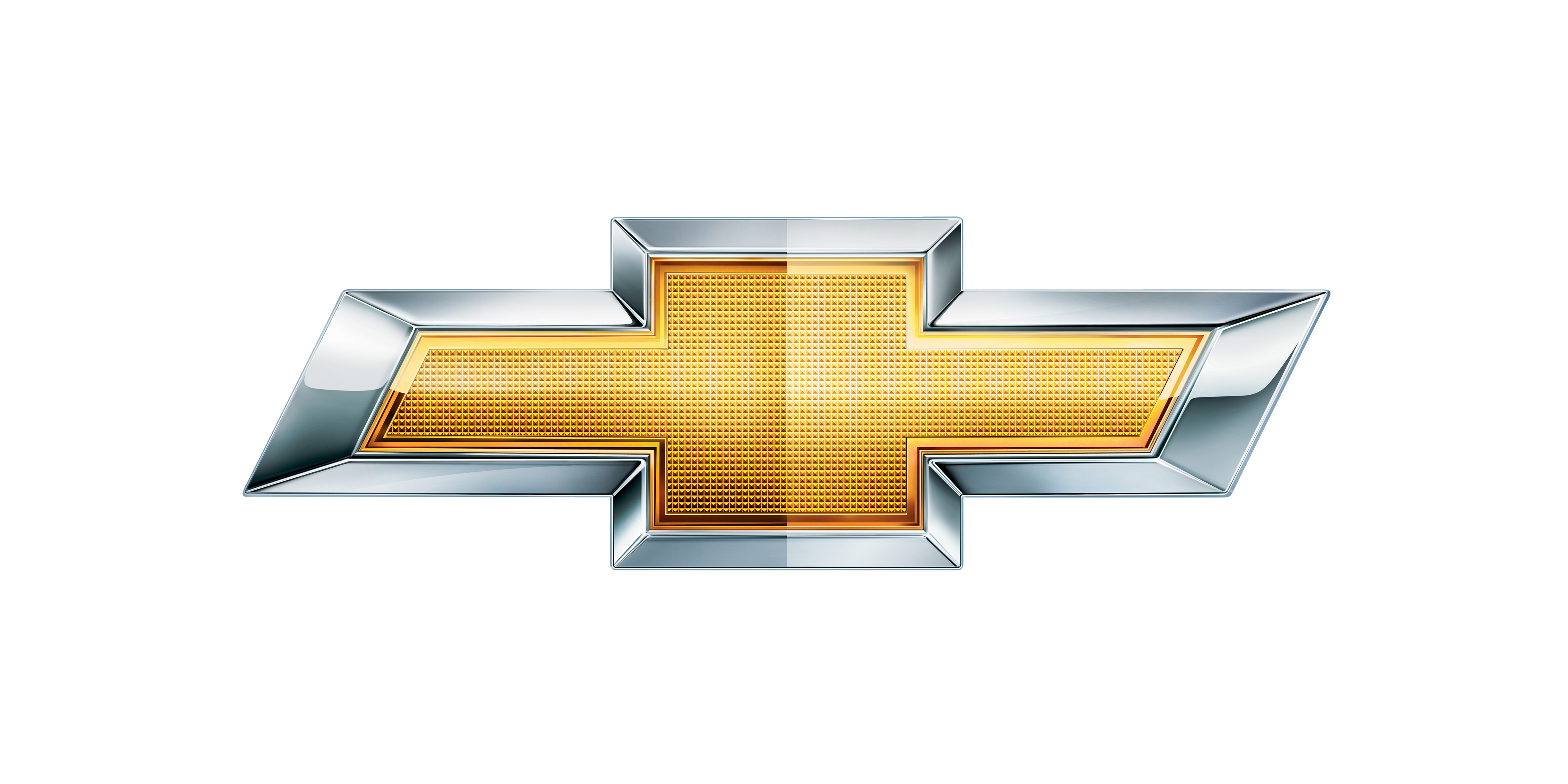
2000 when another change of colour occurred. The millennium emblem was designed
in different shades of gold colour, symbolized enthusiasm, paired with
excellence and stood out among other car logos.
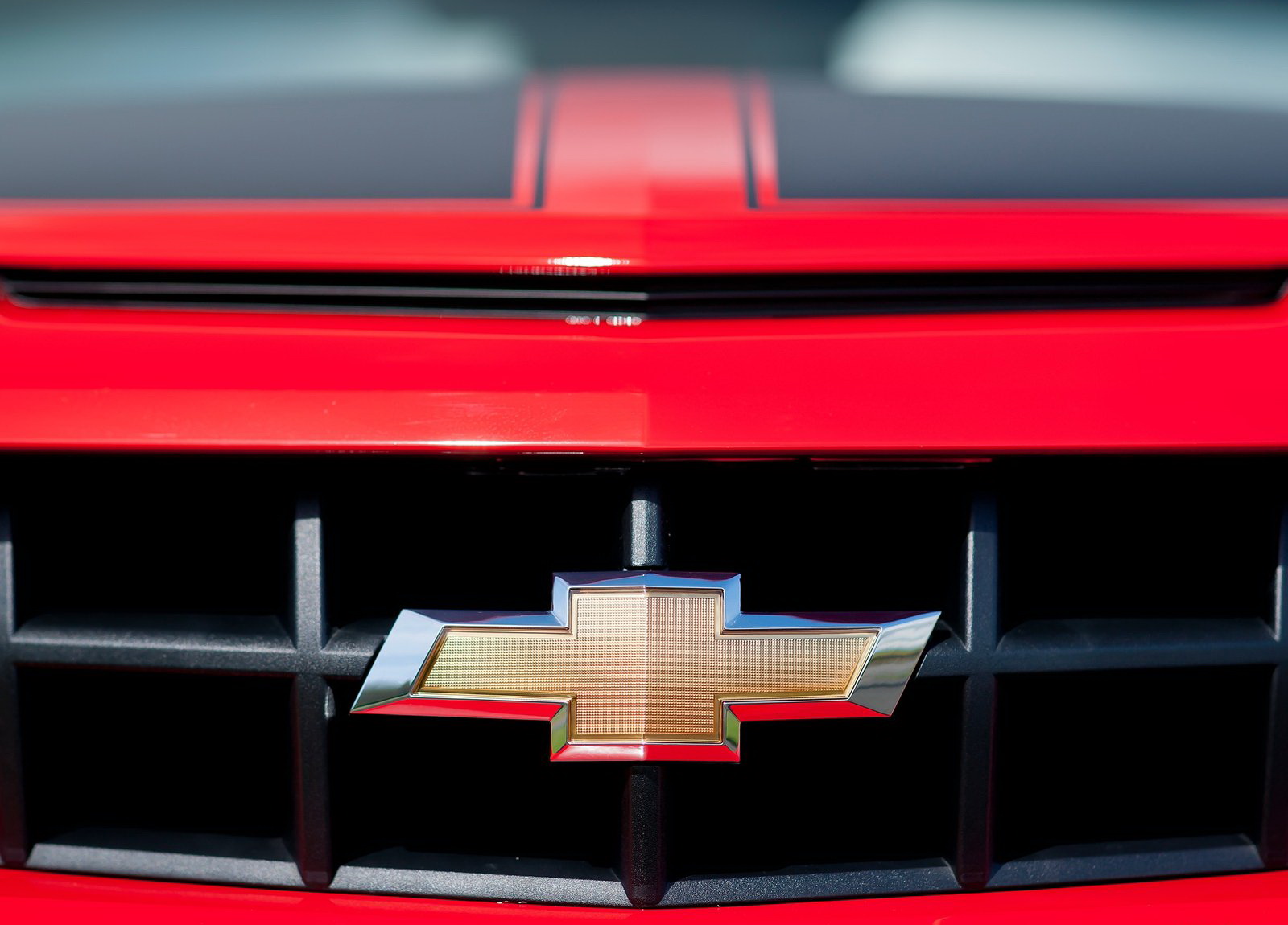
The latest update, introduced in 2011 to
commemorate the company’s centennial anniversary, saw the logo turn more vivid
and get attractive polish.
Chevy Logo
Description
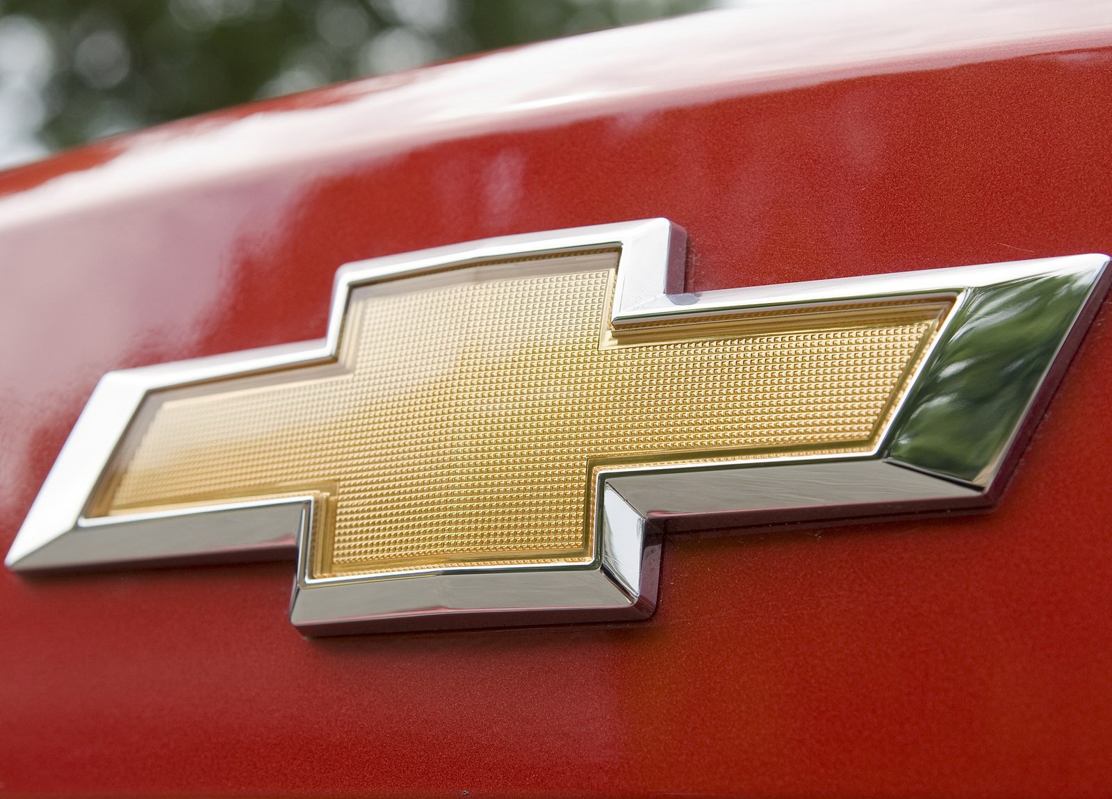
Chevrolet has one of the most recognizable
logos in the world and it has changed little through the history. It is often
described as a cross and is known in North America as a bowtie. However,
despite featuring two intersecting patterns, the logo has little to do with
both cross and bowtie. The horizontal parallelepiped is overlapped by the
square to form a cross-like figure. It is painted yellow and gold and is easily
associated with one of the biggest car brands.
Shape of
the Chevrolet Symbol
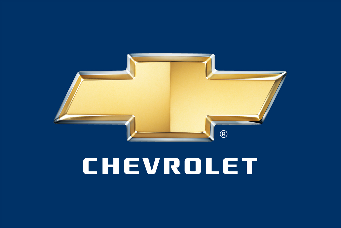
Chevy logo’s shape has remained virtually
intact since 1914, giving the idea of consistency, tradition and recognizable
image to the customers over the decades. Commonly known as ‘The bowtie’, the
logo basically features two thick stripes, overlapping each other in the shape
of a cross. The horizontal bar that used to bear the name of the company on
earlier versions is designed as a rhomboid.
Colour of
the Chevrolet Emblem
The famous Chevrolet logo is designed in gold
and yellow colours, decorated with a silver border. Such vivid colours stand
out the brand’s logo and call for enthusiasm and strength. The company’s name
beneath the logo is written in black letters. Yet, the
present colours have only been used since the beginning of the 21th century.
Before that, the emblem used to be black and white or blue.
No comments:
Post a Comment