Renault
Logo Meaning and History
Renault enters the top list of major
automakers all over the globe. At the same time this brand is the major car
producing company in France with a very rich history. It is specialized in
manufacturing wide range of auto models, trucks, buses, tractors and other
vehicles for different purposes. After it established collaboration with Nissan
it turned on to one of the biggest auto producers in the world making it
possible to compete with other giants of automotive industry. At the moment it
has over 128 400 employees with €72.93 annual assets.
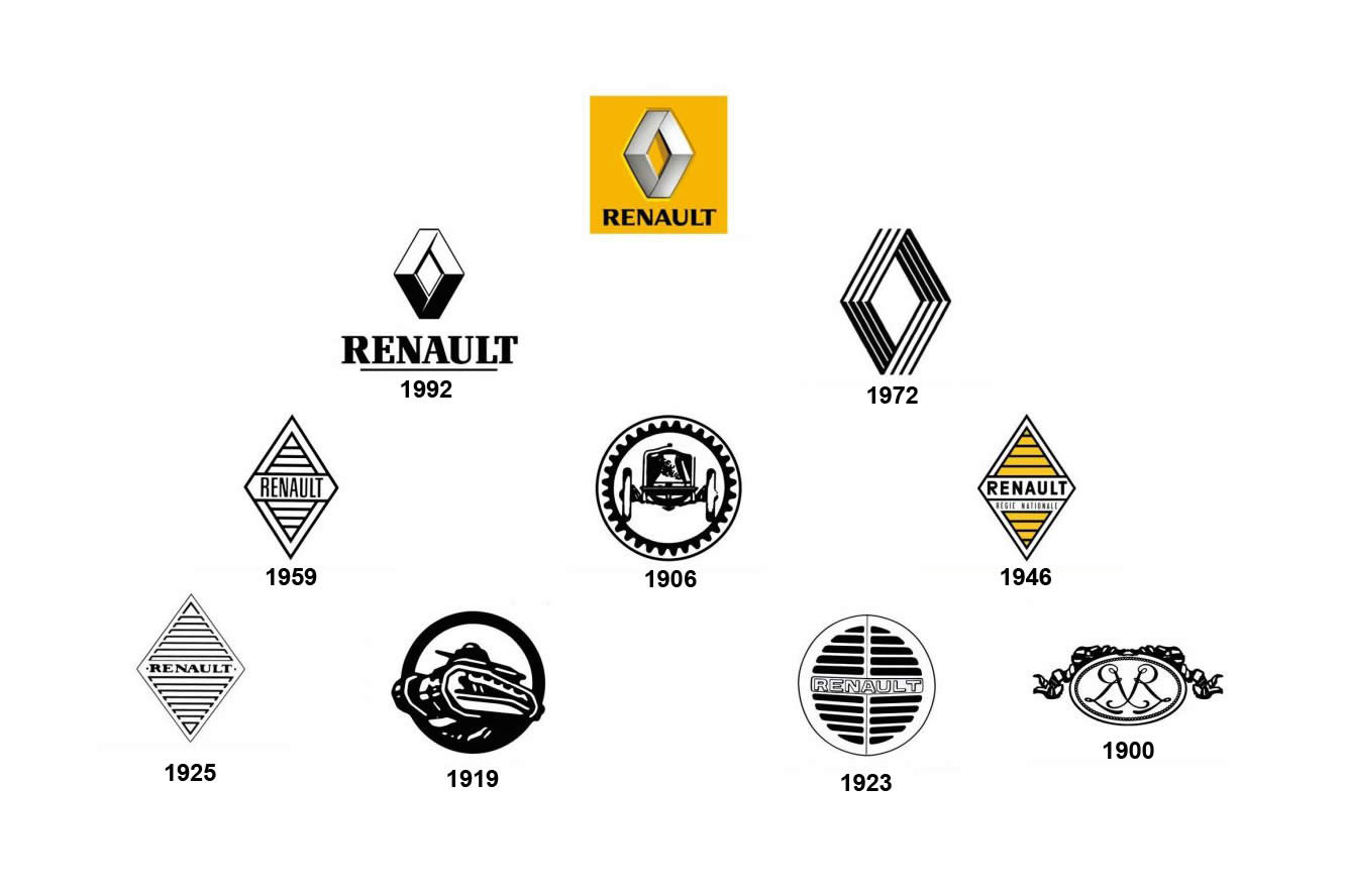
Not surprising that Renault badge is among
the most recognizable logos. The brand was founded in 1899 by Renault brothers.
This is when newly established company got its first official logo. At that
time brand was called Société Renault Frères. The badge was rather simple
containing the initials of every brother. However it underwent numerous changes
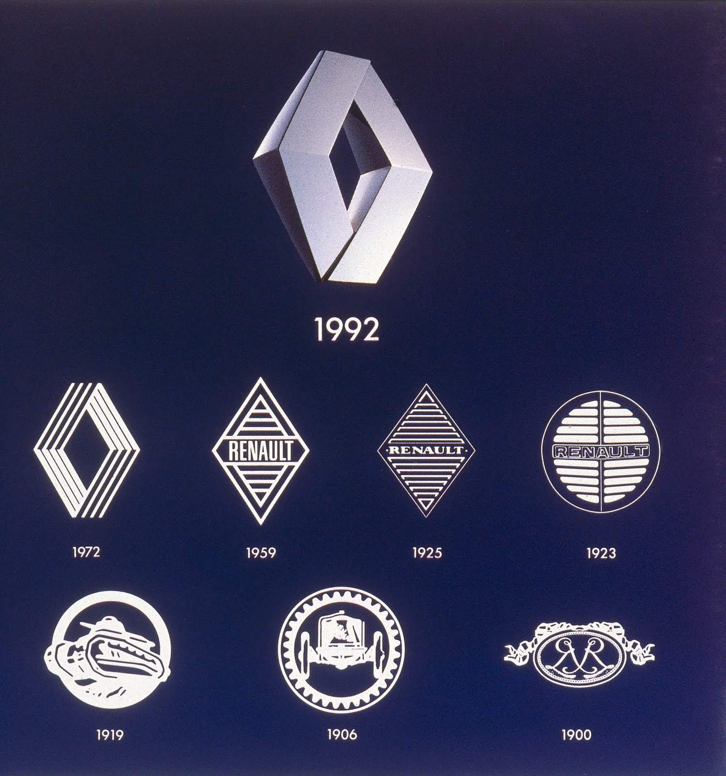
and modifications throughout the history of the company. First redesign was
made in 1906. However the firs diamond shape which is known all over the world
appeared only in 1925. Only slight modifications have been made since that time
during 1946 and 1959. But the base of the logo was still the same till present
days.
In 1972 directors of Renault asked Victor
Vasarely who was a famous artist and designer to renew the badge and add some
details. The idea was to make the badge more eye-catching. Vasarely decided to
retain diamond shape. However he managed to make it clearer and more dynamic.
Artist also added several angular lines to make it look stylish and up-to-date.
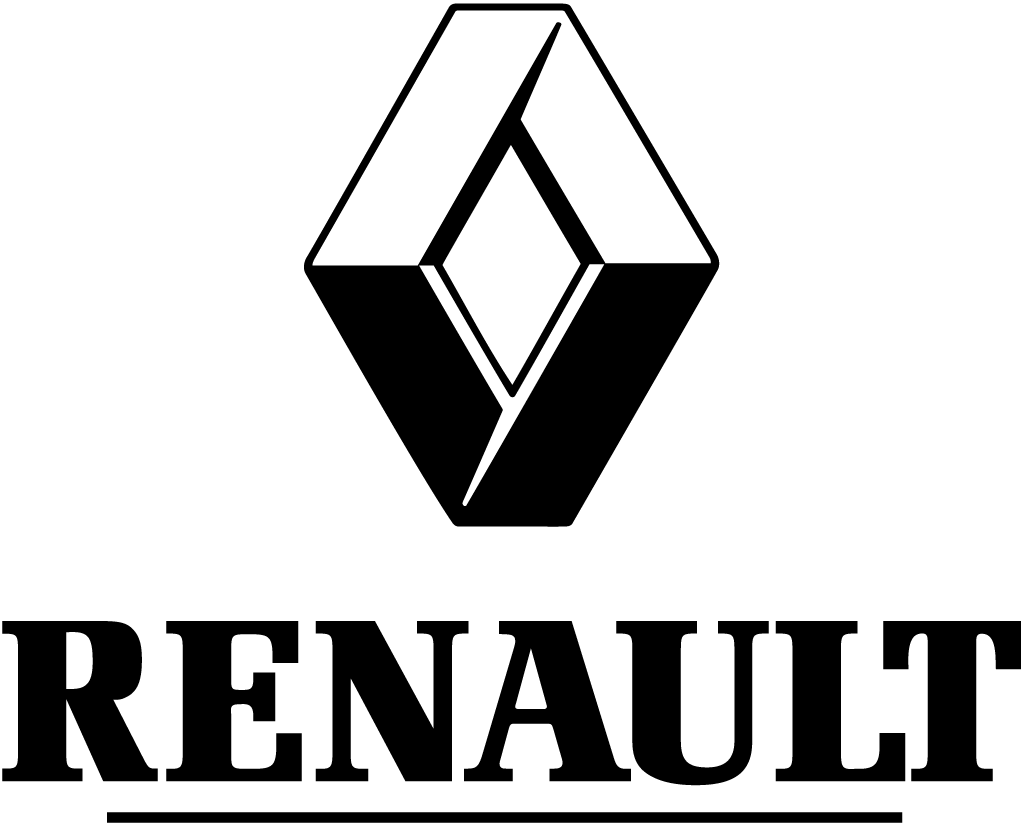
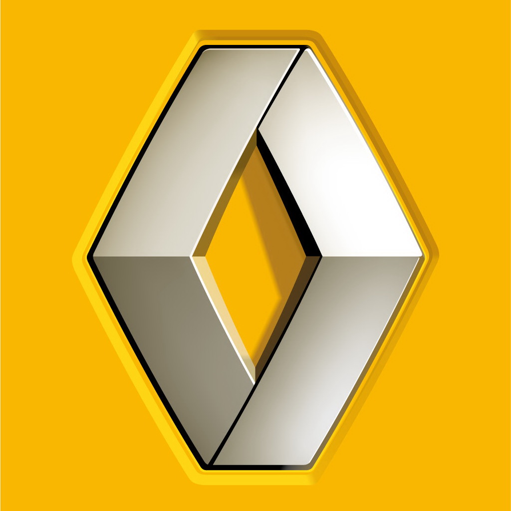
The form which is known to all Renault fans
was firstly introduced in 1992. Later logo was updated and several changes have
been made in 2004 and 2007. This is when the name of the company appeared on
the badge together with square coloured yellow making it more dynamic and
modern. Every detail has a special meaning and refers to particular qualities
of the company and autos it produces. For example, silver colour means
sophistication and creativity. Yellow background means prosperity ad optimism.
Emblem
Description
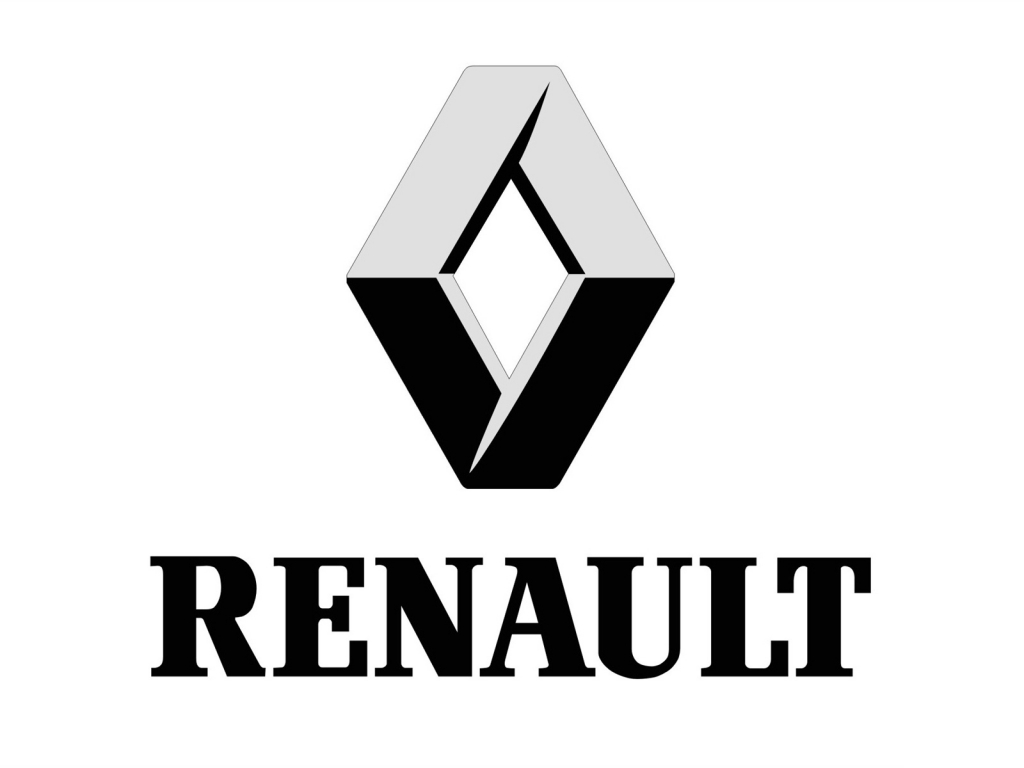
The current version of Renault emblem depicts
the name of the company located on the yellow background made in shape of a
square. Diamond figure is located on top of the company’s name. There have been
a lot of argues whether to return yellow background or not. However
French designer Jean-François Porchez had no doubts it would bring more dynamic
and modern look to the badge. This version has been designed by Porchez in 2004
with several changed made in 2007. But the base and forms are still the same.
There is also another version of the logo which depicts Renault MN where MN
stands for the Wolff Olins consultancy firm.
Shape of
Renault Symbol
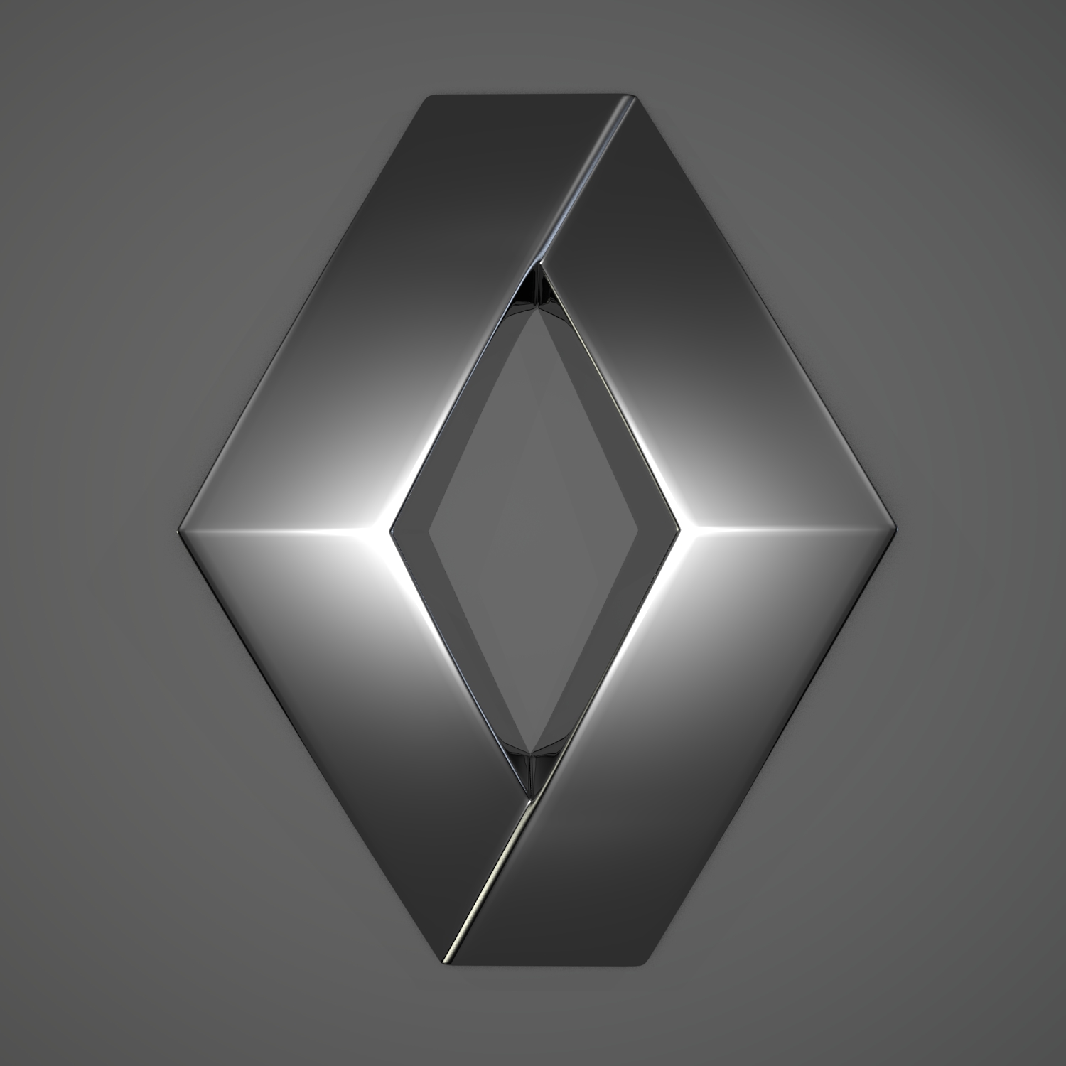
Every detail in Renault badge has specific
symbol. When it comes to the shape of the logo we should firstly consider
silver diamond which is located on top of the company’s name. Silver colour was
not chosen occasionally. It symbolizes creativity and sophistication of French
Car engineers. Every new model comes with innovations and latest techs which
make these autos very popular with consumers all over the world. Few people
know that several shapes have been used for this logo. They included circles
and ovals. But in 1925 diamond was chosen once and for all with further slight
modifications and changes.
Colour of
Renault Logo
Yellow colour was also chosen not accidently.
It was already once introduced but later neglected by designers. However it was
brought back in 2004 in order to represent optimism and prosperity. In addition
Yellow Square turned out to be a good idea making the logo more eye-catching
and recognizable.
No comments:
Post a Comment