Nissan
Logo Meaning and History
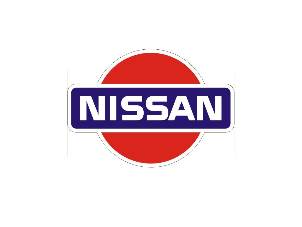
From the foundation of the company in 1930s
Nissan Motor Company produced both Datsun and Nissan-branded vehicles. However,
according to the company’s policy, it was Datsun that provided cars for export
markets and required a recognizable logo to advertise them. A simple yet clever
logo was introduced — a blue rectangle with Datsun inscription in white
letters, embedded into the red circle, reflecting the sun. It was a Japanese
symbol and Datsun cars quickly became associated with the land of the rising
sun. Nissan-branded vehicles mainly targeted the Japanese car market and a
modest Nissan wording was sufficient.
The company’s designers experimented with
fonts and colours, but it was not before 1984 that Datsun division was
discontinued and Nissan inherited the blue and red emblem. Slight changes were
introduced to the logo and the company went on with using virtually unchanged
emblem that had been active since 1932. However, the company was looking for
new identity and a more elegant badge to keep up with the times.
The new logo was introduced in 1988 as the
blue colour was replaced with grey and the red circle turned silver. A stylish
Nissan font was used as a logo from 1989 to 1990. Shifting back to the
rectangle and a circle in 1990 Nissan painted the logo black and white. The
circle merged with the horizontal block. After the company’s takeover by the
French automaker Renault in late 1990s, Nissan was going through major
restructuring to make it through financial difficulties.
The new emblem was part of this process as
the stylish and modern silver and black logo guided the company into the new
era.
The circle and rectangle disintegrated to add
sharp and elegant look.
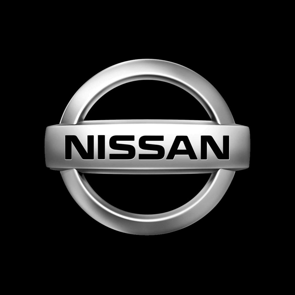
The latest update from 2012 saw the logo
acquire gradient shades of silver and grey. Matched with the company’s new
slogan, ‘Innovation that excites’, the emblem reflect the brand’s new identity
but refers to long-standing traditions. Today Nissan cars are recognized for
quality, innovation, elegance and have leading positions in many global
markets.
Logo
Description
One of the global leaders in car
manufacturing, Nissan inherited the logo from its predecessor and sister
company Datsun in 1984, replacing ‘Datsun’ inscription with ‘Nissan’ one. Ever
since their emblem has consisted of a horizontal block with the company name,
embedded into a circle. Several updates turned it into the emblem, recognizable
around the world. The silver elegant sign is associated with Japanese quality,
innovation and elegance and powers the company to success.
Shape of
the Nissan Symbol
Like its predecessors, the present Nissan
emblem features two simple geometric shapes — a horizontal rectangle with
Nissan inscription and a circle overlapping it. This has been a trademark shape
of Nissan logos since the introduction of the first Datsun logo back in 1930s.
Colour of
the Nissan Logo
The present Nissan logo is designed in
different shades of silver and black to highlight excellence, sophistication,
modernism and creativity of the brand. The word ‘Nissan’ inside the logo
features the black font.
No comments:
Post a Comment