|
|
|
| |
|
Ford Logo
Meaning and History
Ford Motor Company is proud to have one of
the most recognizable corporate logos in the world, the one that has been used
for most of the company’s history. Yet, Ford’s first production car, Model A,
introduced in 1903, featured an emblem with stylized ‘Ford Motor Company’
wording, complete with a fashionable artistic border.
From 1906 to 1910 the American car company used
a patented script, known as ‘Script with wings’, which was a thoroughly
designed Ford signature with extended “F” and “D” letters. By 2010 Ford has
come up with the final revision of the wording that has not changed ever since.
The famous Ford oval dates back to 1907 when
the British entrepreneurs Perry, Thornton and Schreiber, responsible for the
company’s advent to Great Britain, decided to highlight Ford cars’ reliability
and economy through the oval-shaped logo.
The idea was supported by Henry Ford in 2011
and the notorious combination of script and oval badge became the trademark of
all Ford vehicles sold in Great Britain. Yet, the rest of Ford automobiles and
company internal communications went on to use the plain script lettering
through the late 1920s.
In 1912 the oval logo made way for a new
winged triangle design. Originally introduced to symbolize speed, light weight,
stability and grace, the logo came out in dark blue or orange colour and
featured “The Universal Car” wording at the bottom. However, it did not last
long since Henry Ford disliked the emblem.
The new 1927 Model A was the first Ford
automobile to carry the famous Ford oval on the radiator grill. Deep royal blue
background became the company’s trademark and the oval badge has been used on
many cars through 1950s. Starting from 1976, the blue and silver oval became an
essential feature of all Ford vehicles. It has become a recognizable symbol of
the company, its facilities and products all around the world and turned into
one of the most expensive trademarks.
Celebrating the company’s 100th
anniversary, Ford introduced the latest version of the logo in 2003. The blue
colour became gradient, while silver colour was replaced with white. The shape
of the oval turned more flattened.
Logo
Description
Ford logo is a flattened oval figure designed
in several shades of blue and white colours. The famous stylish Henry Ford
signature is embedded into the oval. The company has always stressed on the
importance of tradition, recognition and elegance and only introduced minor
corrections to the logo through the long and successful history.
Shape of
the Ford Symbol
Ford has been reliant on oval shape of the
logo for most of its history. It looks simple and elegant, provides visual
distinctiveness and makes it one of the most recognizable commercial emblems
all around the world.
Colour of
the Ford Logo
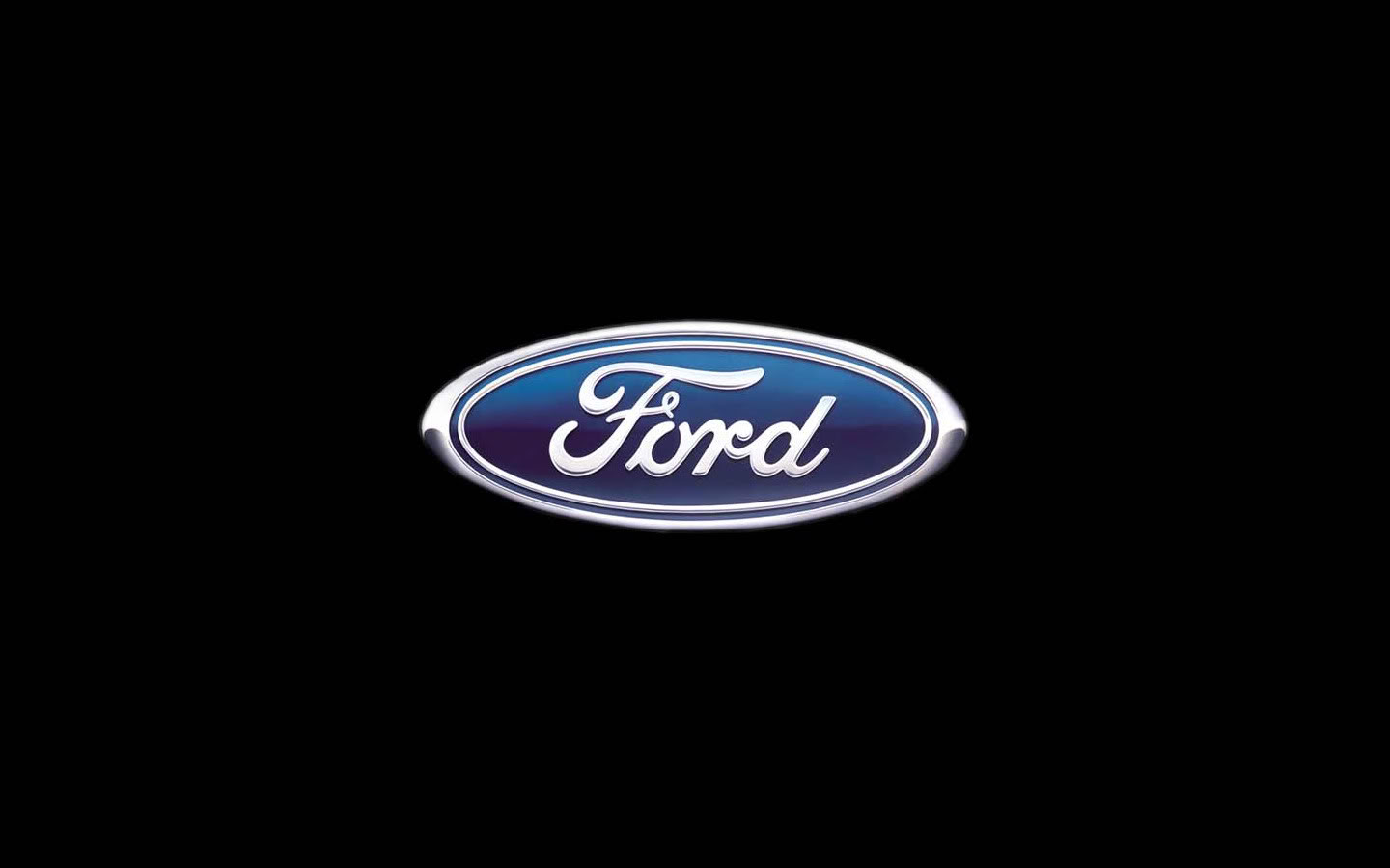
The Ford logo has long been associated with
blue colour which has earned it wide recognition. The latest version of the
logo, introduced in 2003 to celebrate Ford’s 100th anniversary,
features a gradient of shades, from light blue at the top to navy blue at the
bottom. The ‘Ford’ wording is designed in white letters and there is also a
white oval line, embedded into the logo. At the dawn of Ford Empire the emblem
used to be black and white.
No comments:
Post a Comment