Buick Logo
Meaning and History
Buick has a special place in US automotive industry,
being the oldest active American car brand and the founding member of General
Motors Company. Naturally, the brand’s emblem has changed a number of times
since 1903 to conform to car fashion, contemporary design and marketing needs.
The first Buick logo was a simple ‘Buick’
wording across the radiator grill in honour of the company’s founder, David
Dunback Buick. As time went by, the company was looking for alternative logos
and different variations of the ‘Buick’ word were used. A stylized ‘B’ with the
letters ‘uick’ embedded into it was used as the company proved successful at
the beginning of the century. Another emblem that did not last long was the
‘Buick’ word on blue and white rectangle.
It was not until mid 1930’s that Buick cars
first came out with the logo based on the ancient Buick family coat of arms.
The company’s executives were looking for a more sophisticated emblem that
would reflect the brand’s upmarket positioning just below Cadillac, according
to GM hierarchy. The idea to refer to the ancient Scottish coat of arms,
belonging to the Buick (then Buik) family changed the logo forever. It
reflected the prestige of both family and cars produced under the Buick name.
The original shield had a rectangular shape
and was designed in terracotta colour. White and blue checkered stripe was running
from upper left to lower right corner. A golden cross and a golden deer head
completed the emblem. This image was the cornerstone of future variations of
the Buick logo. During the following 20 years the colour changed from
terracotta to red, the rectangular shape was replaced with heraldic and then
with a shield-like shape. The golden images of the cross and deer head turned
silver. In 1959 a strongly different emblem was introduced. One coat of arms
was replaced with three shields placed inside a silver circle to commemorate
the launch of three new models.
Mid 1970’s was a difficult time for most car
manufacturers and Buick was also looking for new ways to save their market
share. A new logo depicting a ‘Happy hawk’ was introduced. However, by 1990 the
traditional tri-shield was reincarnated with minor changes. Diagonal stripes
became plain, while the cross and deer were discontinued. The latest version of
the logo was introduced in 2002, surprising many with its monochrome silver
design. Yet, it combines the company’s heritage and modern elegance.
Logo
Description
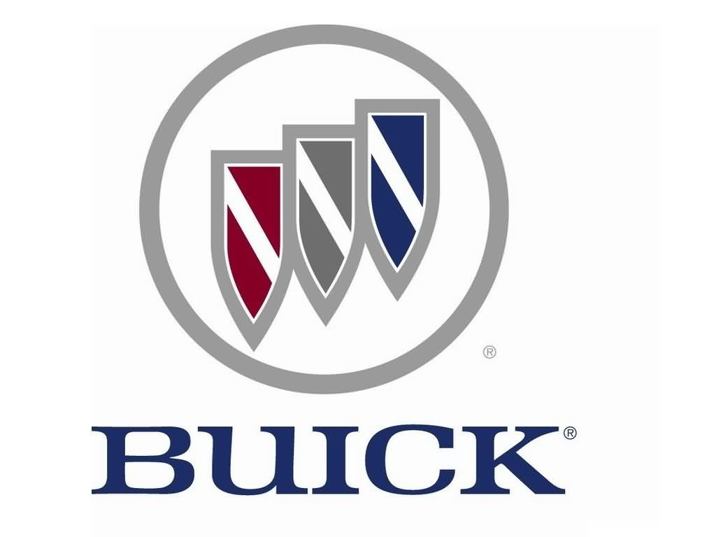
Buick has tried many emblems throughout the
history, but most of them have been based on the coat of arms of the Buick
(Buik) family, coming from Scotland. In 1960 the three shields appeared on the
logo for the first time to represent the company’s lineup of three models –
LeSabre, Invicta and Electra. The current three shields keep the brand’s
traditions, but are designed in different shades of silver and feature plain
diagonal lines that used to be checked on earlier versions. The silver circle
around the shields completes the modern Buick emblem.
Shape of
the Buick Symbol
The central part of the Buick logo is a
triple shield, also known as a tri-shield. The elongate shields are placed in a
row, rising from left bottom side to upper right side. They are embedded into a
circle.
Colour of
the Buick Logo
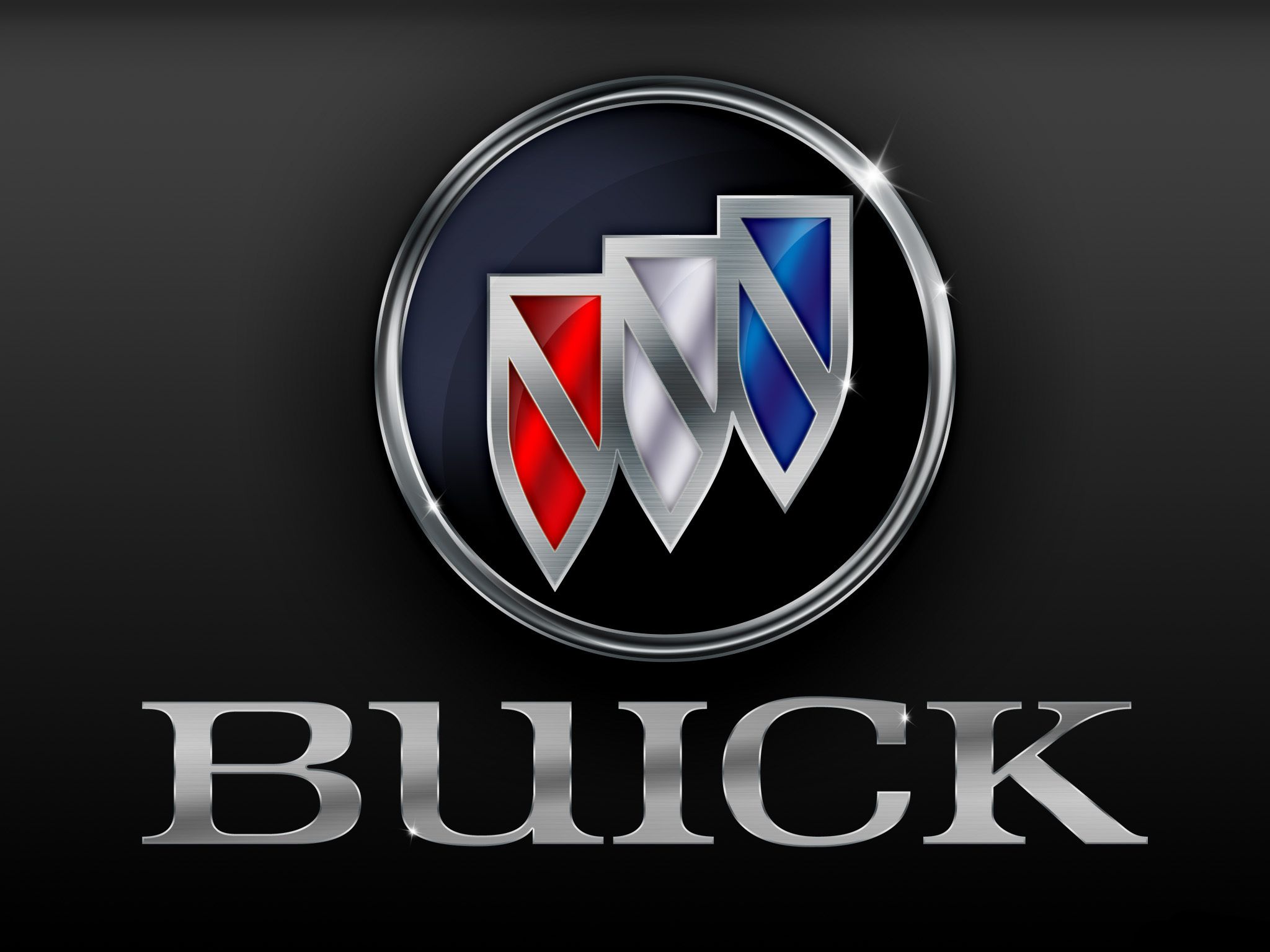
The current Buick logo, introduced in 2002,
is all silver, highlighting the elegance of the brand. The emblem features
gradient shades of grey to give it a more eye-catching look. However, the
original colours of the tri-shield were red, white and blue in honour of the
Scottish Buik family coat of arms.
No comments:
Post a Comment