Alfa Romeo
Logo Meaning and History
There have always been lots of myths and
legends around the origin of Alfa Romeo official logo. Though popular Italian
Automaker was founded in 1910, its badge was changed and
evolved numerous times throughout its long history. That is why it is rather
hard to speak about the origin of the badge taking into account lots of
different versions. We will try to stick to the facts.
It is commonly known that the logo was
created on the base of Visconti family coat of arms. At the same time it has a
background in form of the Red Cross which is a symbol of Milan. At the same
time it is said that cross was used in order to commemorate Giovanni Da Rio who
was the first one to erect the cross while climbing the Jerusalem wall during
crusade. That is why some people say that the badge is mainly a shield which is
reversed over the Castello Sforzesco located in Milan.
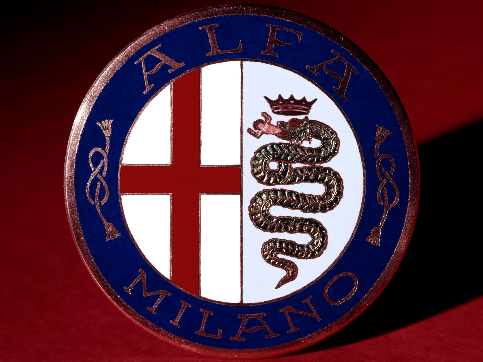
This is probably the hardest part of the
puzzle provided by Alfa Romeo badge. From this point everything is a bit easier
and clearer for understanding. A.L.F.A stands for Anomina Lombarda Fabrica
Automobili. The first version of the badge appeared in 1915. It had Alfa
letters written on the top of the logo. Two figures of eight knots were placed
in the middle of the badge and Milano underneath the composition. However it
was changed 5 years later depicting Alfa Romeo writing over Mila no red cross
which was located at the bottom. After Alfa models won numerous racing titles
and competitions it was decided to mark this fact on the logo of the company
which featured gold trim for encompassing the badge. In 1927 it was changed
again and trim disappeared from major Italian automaker and later returned.
Apart from all changes it still keeps
heraldic spirit and looks rather ancient and classy. This is probably why it is
in top of the most recognizable badges of all times. In addition it has always
attracted auto fans and gourmets with its mysterious and myths related to the
origin of the badge. During its history and development it also received
several new elements including a giant snake which eats a man. Let’s try to
figure out what it means and reveal all secrets of Alfa Romeo logo.
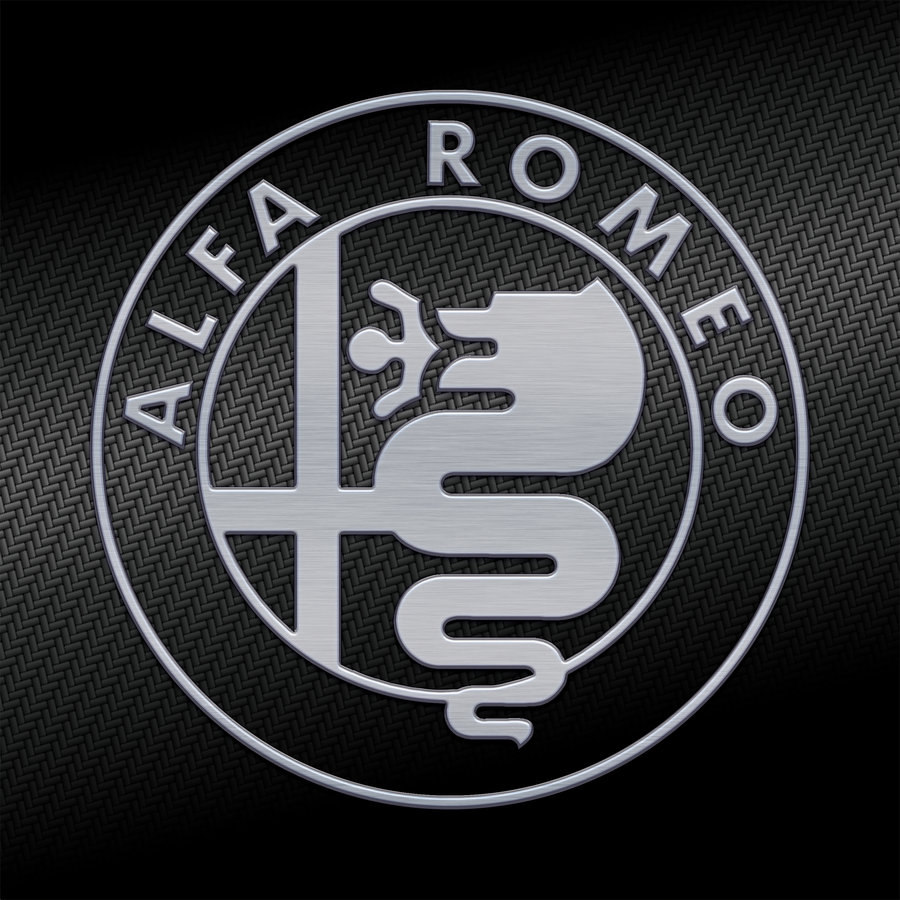
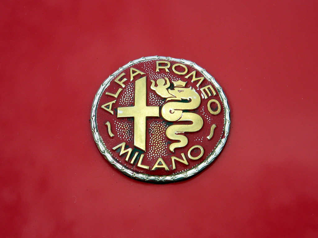
Logo
Description
As we had already mentioned Alfa logo has a
very strong historical background featuring heraldic ancient elements. The Red
Cross as one of the main elements is supposed to be associated with Milan. This
symbol was often used after Crusades. On the other hand Red Cross is widely
spread among other Christian symbols.
A biscione is one of the most controversial
elements in Alfa badge. At the same time logo depicts a man which can be
described as a child which is also known as Saracen or Moor. In other words the
whole scene describes crusaders’ defeat which sounds a bit strange.
Representatives of the company are not eager
to recall those times and give the exact definition of their logo telling it is
nothing more but an ancient city.
Shape of
the Alfa Romeo Symbol
Alfa Romeo badge is made in round shape which
encloses heraldic Red Cross, huge snake eating a man and golden Alfa Romeo
letters which are located on the top of the circle. Milano writing is
underneath. Nothing is known for sure about the fact why the founder chose such
shape for his company’s logo. Nevertheless it is still one of the most
recognizable badges not only in Italy but also in the rest of the world.
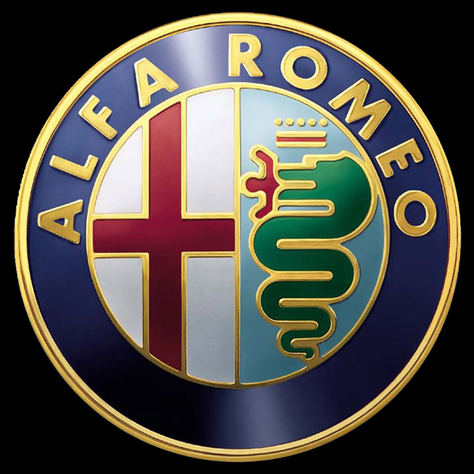
Colour of
the Alfa Romeo Emblem
Several colours are used in Alfa logo
including white and blue background. Some colours reflect ancient sacred
meanings which were used in Christian religion during crusades. The Red Cross
is a good example of such symbol which is also associated with Milan and
crusaders. Green snake eating a man that can be interpretation of a modern
child which symbolizes the defeat of crusades which looks rather strange on the
background of Italian history and symbolism.
Several logo versions were made with gold
trim in order to commemorate numerous racing titles and wins throughout brand’s
successful racing history. However the idea was not very popular and in two
years after gold letters were introduced they were removed from the badge.
No comments:
Post a Comment