Chrysler
Logo Meaning and History
When Walter Chrysler united some great
engineers to establish a new American automotive brand, he had a distinct idea
to create affordable luxury passenger cars to compete with the best in the
class, such as GM’s Cadillac and Ford’s Lincoln. They introduced innovative
engineering solutions to put their cars ahead of the time. Soon Walter decided
to establish the Chrysler Corporation that would embrace such companies as
Chrysler, DeSoto, Dodge and Plymouth.
Chrysler division was meant to be an upscale
make in the company’s hierarchy. Through the long history the brand has seen
ups and downs and eventually merged with the Italian giants FIAT to become part
of the FCA US. According to the Group’s plan, Chrysler is set to be marketed as
a mainstream brand with certain premium features.
As a premium make in the Chrysler
Corporation, Chrysler division required a special logo that would appeal to the
customers. In 1924 Oliver Clark, who made part of the engineering team around
Walter Chrysler, came up with two emblems that were meant to become the brand’s
iconic symbols for years to come. The original logo represented a wax seal that
symbolized the approval of Chrysler vehicles’ quality. It was matched with a
blue ribbon in the lower right side.
Silver-winged radiator figure was another
creation of Oliver Clark. The wings represented the speed of the Roman god
Mercury. These two iconic symbols have always been associated with the company
and were united into one logo at certain times. In 1930s the seal was placed in
the middle of the wings for the first time. In 1940s Chrysler introduced a new
emblem, with the seal placed onto a heraldic shield with a crown on top,
Chrysler inscription and silver wings supporting it.
Later on Chrysler used different variations
of the shields and silver wings. The famous Chrysler Pentastar emblem was used
as a corporate symbol, but was not placed on radiator grills. It was used as a
decoration on the hoods of several models instead. In 1980 Chrysler was
experimenting with the fonts in search of a modern look, but came back to the
roots and created another combination of the wings and the famous wax seal that
decorated all the vehicles from mid 1990s. The seal was embedded into an oval
that lied in between the wings.
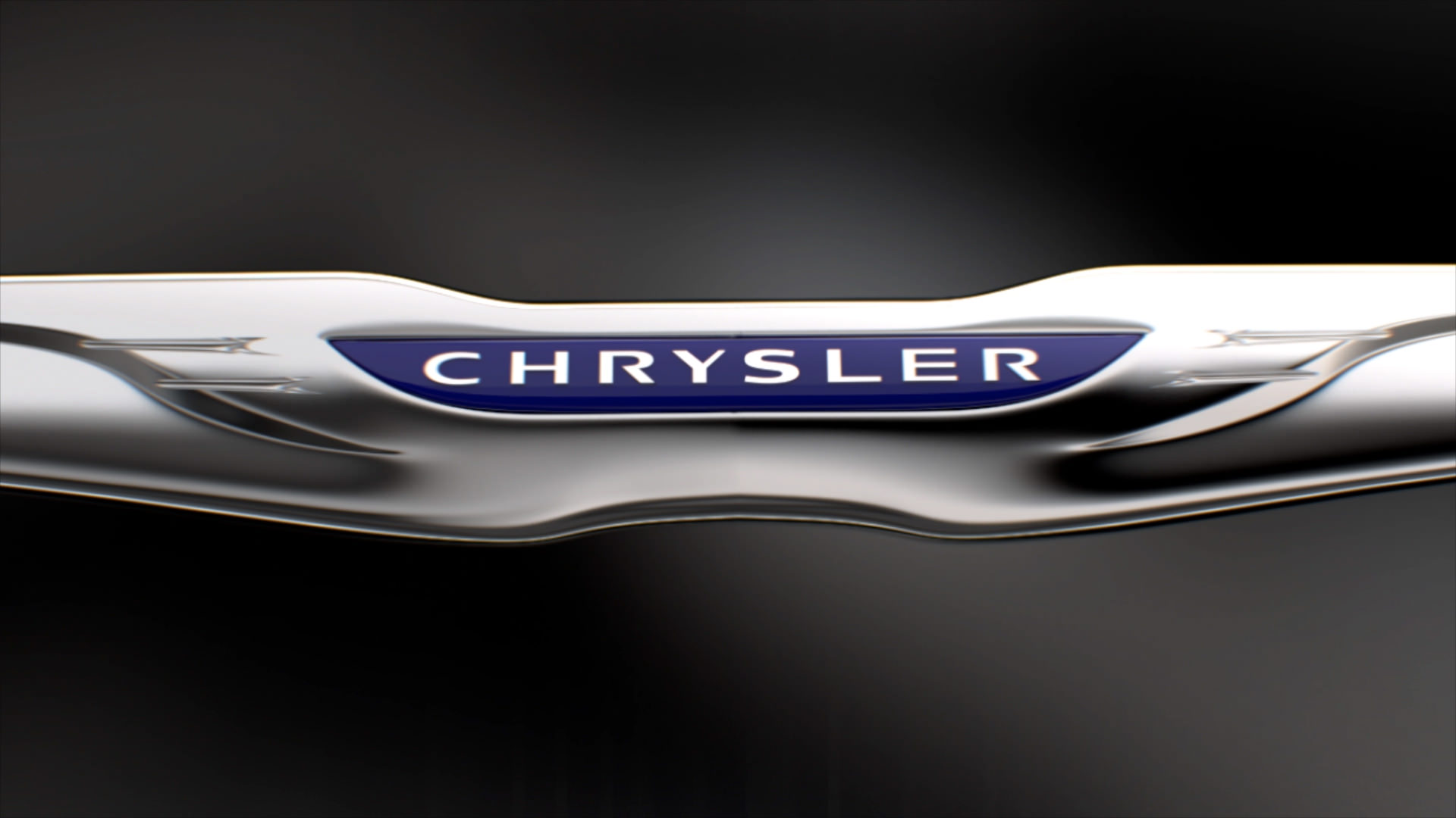
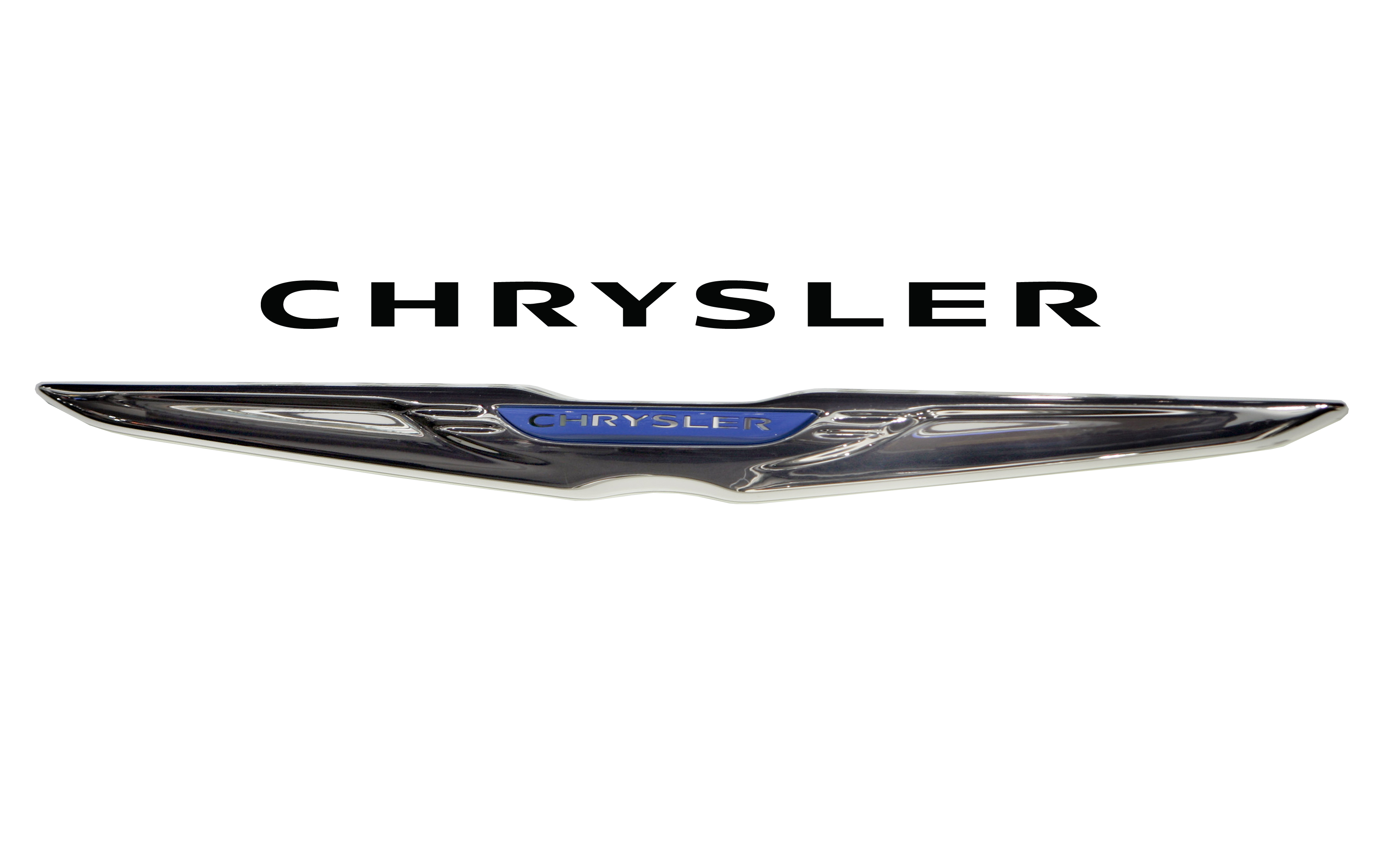
However, after the Chrysler’s takeover by
FIAT, the company’s designers came up with the latest version of the winged
emblem which was deprived of a wax seal. The word Chrysler is now placed on
navy blue background aimed to remind of a historic blue ribbon. The wings
became somewhat elegant and noble.
Logo
Description
The story of the winged Chrysler logo dates
back to the very roots of the company. The latest graphic winged badge,
introduced after the company’s takeover by FIAT, saw the circle with the famous
wax seal being replaced with a stylish Chrysler inscription on deep blue
background. Another Chrysler word lies above the winged symbol.
Shape of
the Chrysler Symbol
The latest edition of Chrysler’s famous
winged logo sees a pair of elegant silver wings matched with a Chrysler
inscription on deep blue background in the middle. Despite the elimination of
historic wax seal sign, the logo represents the company’s legacy through the
trademark silver wings and looks sophisticated and modern thanks to graceful
shape and noble silver colour.
Colour of
the Chrysler Logo
The current Chrysler logo is basically
designed in several shades of silver and grey. The Chrysler inscription is
light silver at the top and saturates to dark silver at the bottom. The winged
emblem is all silver with some shades being close to black colour. The silver
Chrysler word in the middle lies on navy blue background.
No comments:
Post a Comment