Citroen
Logo Meaning and History
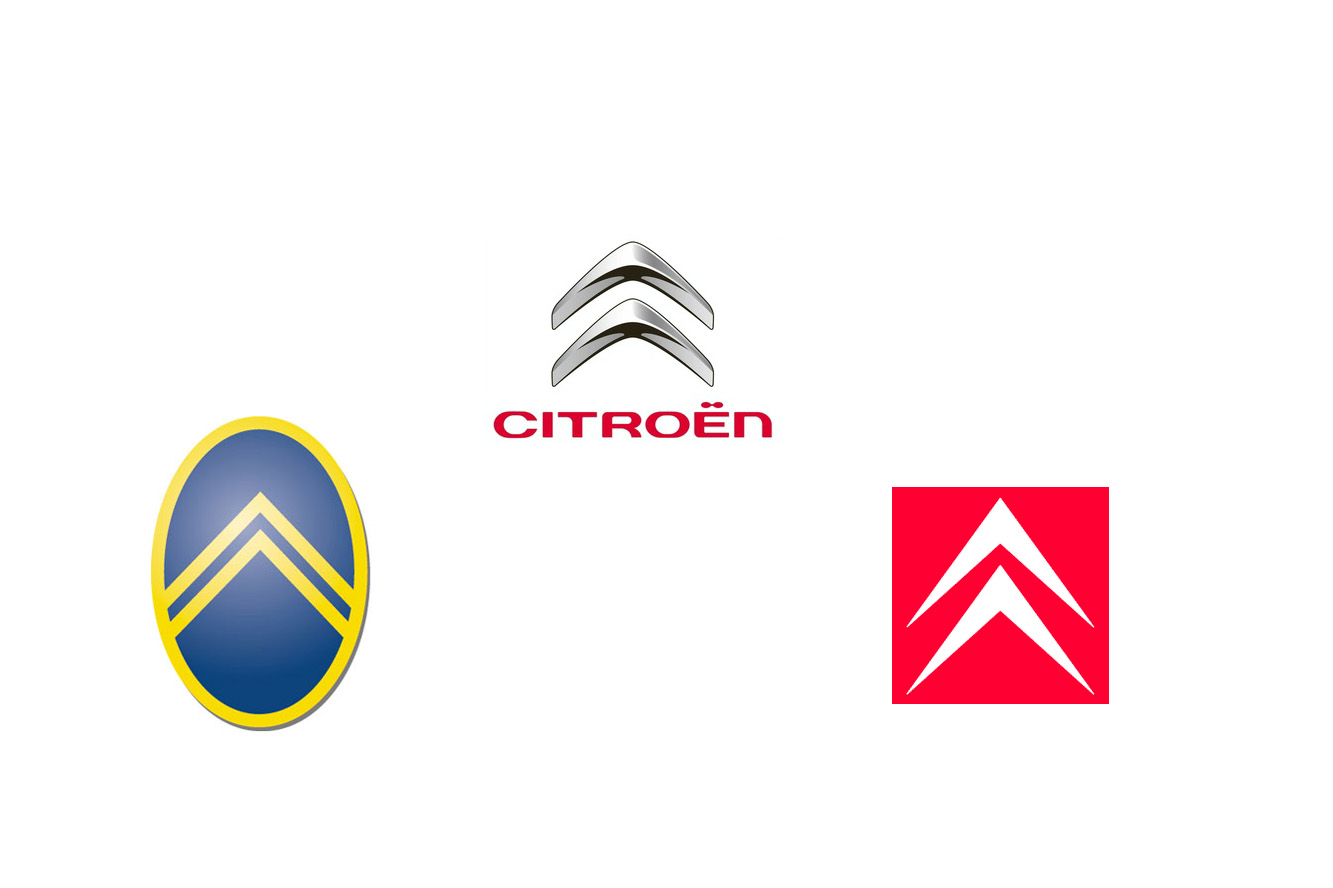
Citroen logo that first saw the world in 1919
has turned into one of the most iconic emblems, associated with engineering
innovations and exquisite French style. Introduced by the company’s founder and
outstanding engineer Andre Citroen, the famous double chevron represented the
paired helical gears that he developed and patented. The logo looked like a reversed
pair of ‘V’ letter or two arrows facing upwards. At the time of the company’s
foundation, Citroen became the leading European car manufacturer and the first
mass car maker outside the United States.
The company has embraced engineering genius
with sophisticated marketing vision in becoming arguably the most innovative
car manufacturer. Citroen has introduced or developed such automobile concepts
as front-wheel drive, unitary frameless body, independent suspension,
self-levelling hydraulic suspension, disc brakes, adaptive headlights,
aerodynamic design and many more. The French Company stood behind the creation
of true sales and service network.
Through the glorious history of the brand the
double chevron logo has always accompanied its vehicles. The first emblem
featured a double helical gear embedded into an oval frame. It was designed in
navy-blue and yellow colours. Citroen stuck to this colour scheme through
mid-1980s, but played with the background and shape of the frame. In 1985
Citroen redesigned its emblem, introducing the red background and making the
white chevrons look sharper than ever.
The modern three-dimensional emblem, launched
in 2009 to mark the company’s 90th anniversary, was designed in
silver colour with black shades and saw the chevrons blur the edges and become
smooth. The Citroen inscription below the logo completes the emblem.
Logo Description
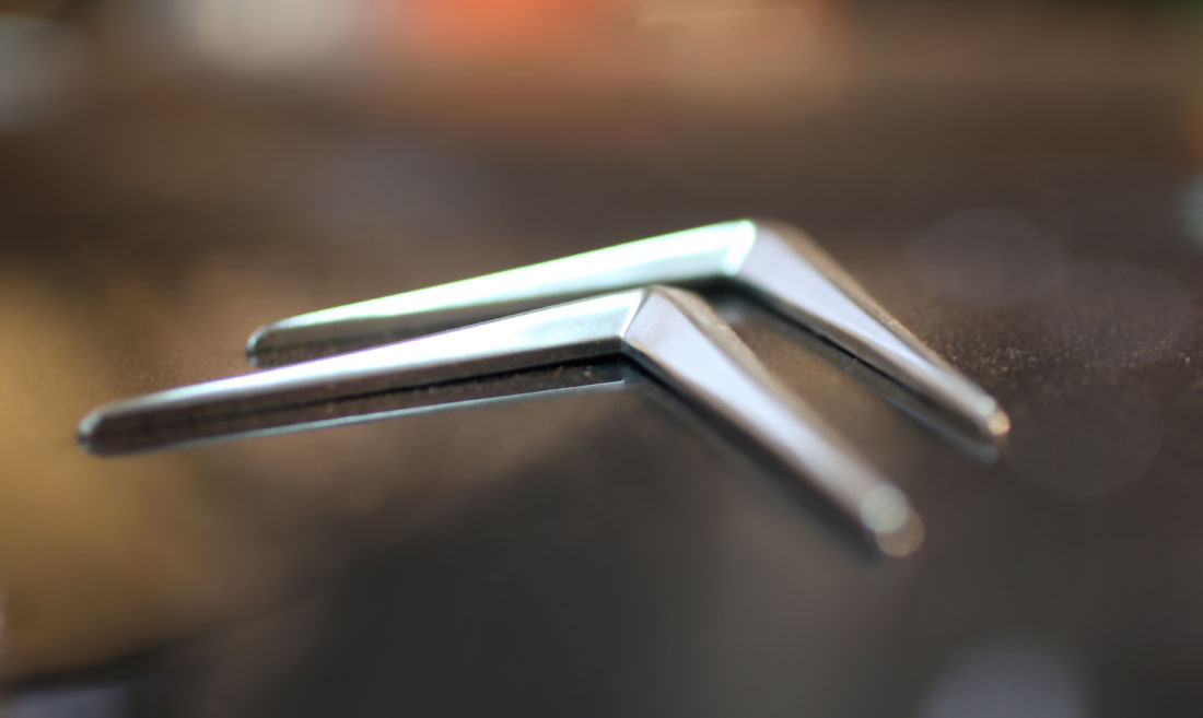
The famous Citroen logo features a stylized
image of double helical gears, paying tribute to Andre Citroen’s engineering
background and early gear business. It also looks like a double ‘V’ sign,
turned upside down, or a double arrow facing upwards. The logo is completed
with a red Citroen inscription below it.
Shape of
the Citroen Symbol
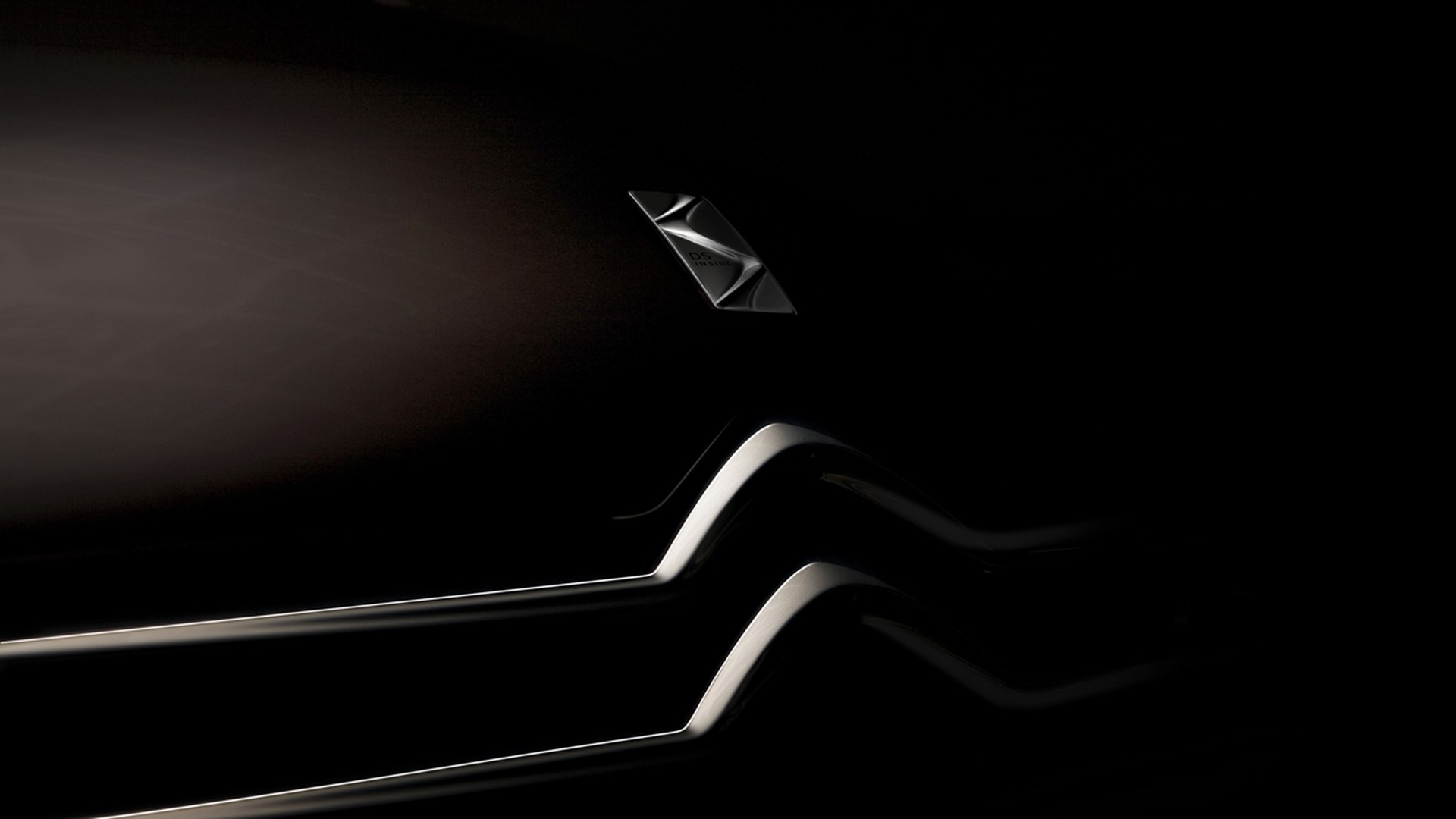
The earlier Citroen emblems featured simple
double helical gears embedded into an oval. Later on they became sharper and
acquired extensional form. However, the latest logo was given a softer,
roundish look, with the ‘V’-shaped gears becoming three-dimensional. The
Citroen inscription was redesigned in the new custom font, contributing to the
new smooth corporate styling.
No comments:
Post a Comment