Peugeot
Logo Meaning and History
Peugeot badge is among the most enduring and
recognized logos in world’s automotive history. If it was not for this badge,
the company could never reach the top and become one of the most prestigious
auto producers over the globe. Brand’s crest has a very rich history. Numerous
versions and changes have been made over decades including Famous Lion Car
Logo.
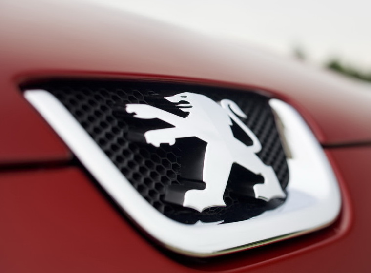
Famous
Lion Car Logo
Famous lion car logo firstly appeared in 1847
when company had nothing in common with auto production.it mainly specialized
in producing steel and blade goods. Image of lion was used to represent all
good features and qualities of company’s products of that time. They included
elastic blade, swift cut and strong teeth. Lion has been officially registered
as trademark in 1858. Later it appeared on arrow of Peugeot Brothers in 1950.
French brand introduced its first vehicle in
1889. It had very little in common with autos that we are used to. In fact it
had three wheels. Nevertheless it was a hit during that period of time.
Moreover this model was also the first to bear brand’s name and its badge. Lion
logo on the arrow was used between 1905 and 1915 on radiators of all models
produced by Peugeot Bros.
First significant changes and modifications
were made in 1933. It was decided to make lions a bit simpler and more dynamic.
Later new heraldic lion appeared on the bonnet of Peugeot cars starting from
1948.This was the time when iconic 203 model was eventually introduced to the
public. In 1965 drastic changes took place inside the company. The brand got
its new name and was called Peugeot S.A. since that time. It was a fresh start
for the brand featuring modified logo. Designers decided to put the head of
lion inside triangle shield which was later replaced by another structure which
had the shape of square.
In 1976 historical collaboration of Peugeot
and Citroën was established. It gave a birth to the PSA Peugeot-Citroën holding
company. Two years later the company became a separate division of Chrysler
Europe. This was time for another change in logo. Directors decided to go back
to heraldic lion in order to strengthen the image of the company. But it looked
more sophisticated and refined. New logo was called “Lion fil”.
Another change of Peugeot crest took place in
1998. Lion got its paws showcasing the power and corporate balance of the
company. Blue colour was also added as association with forward-looking
approach. Current logo which was unveiled in 2002 is known as”Blue Brand”. It
also has a black lion shadow.
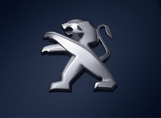
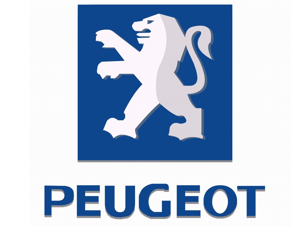
Logo
Description
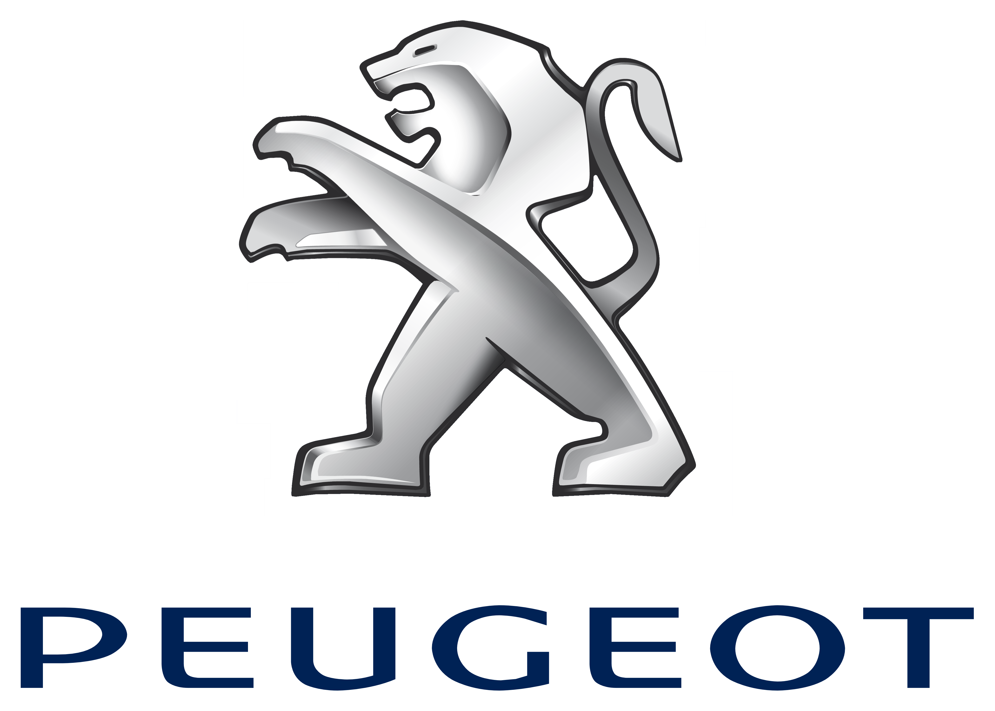
Peugeot depicts a lion on the blue background
with paws and shape. The lion is a historical image which was used from the
very origins of the brand. At first only head of heraldic lion was used on the
badge. Current logo also has lion’s as a symbol of balance, strength and
flexibility. Black shadow was added in 2002making the badge look modern and
elegant.
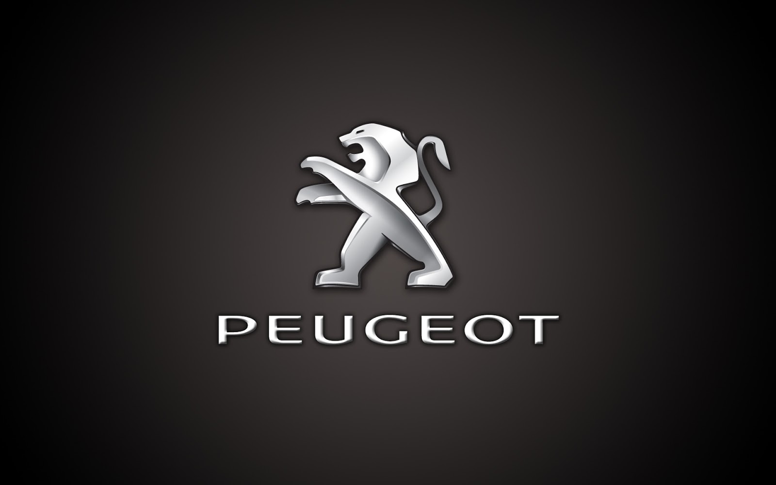
Shape of
Peugeot Symbol
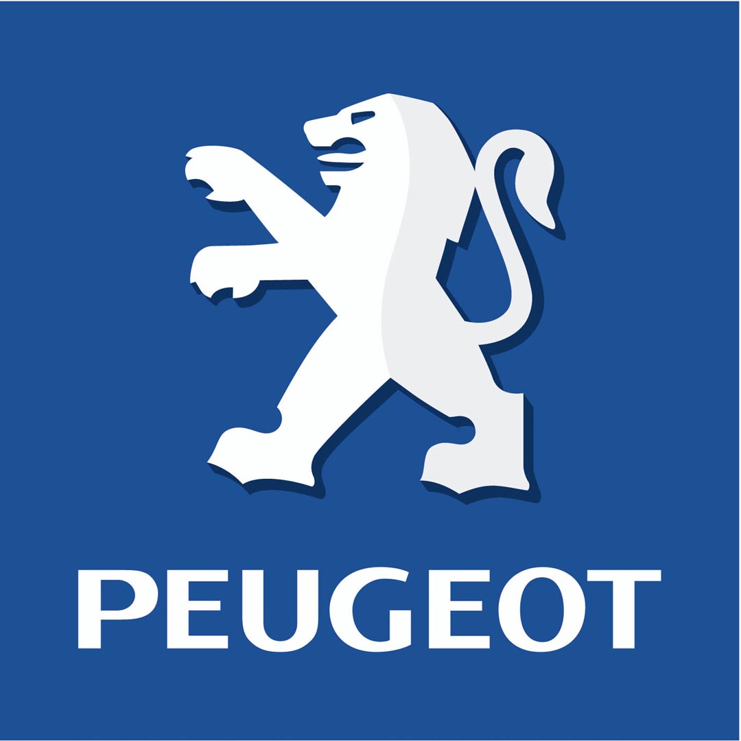
Peugeot symbol is designed in shape of a lion
which located above the company’s name. It is enclosed in Blue Square which
symbolizes unique innovative approach of the company reflected in its every
model. Numerous versions of lions were used throughout brand’s rich history.
Eventually designers decided to go back to the origins with slightest changes.
Colour of
Peugeot Emblem
Peugeot logo contains silver, blue and black
colours. Blue is associated with forward-looking approach of major French
Automaker. Silver stands for innovations and traditions brought by enormous
experience. Black colour is mainly used as lion’s shadow.
No comments:
Post a Comment