Toyota
Logo Meaning and History
Toyota is one of the largest Japanese car
companies in the world and the leader in automotive industry. Its logo is one
of the most recognizable global emblems and is associated with exceptional
reliability, innovation and great value. Yet, the famous oval logo was only
introduced in 1989.
The first emblem that appeared on Toyota cars
in 1936 was the last name of the founder, Kiichiro Toyoda, in red letters,
embedded into what seemed to be a diamond figure. Ten years later it was
replaced with the ‘Toyoda’ word, spelled in Japanese, in a red circle. This
sign remained active in domestic market through 1989. However, with the company’s
expansion to foreign markets and North America in particular Toyota was looking
for a universal logo to consolidate the brand image.
From 1958 a simple ‘Toyota’ sign was placed
on the cars sold around the world. It only went through minor changes before
the launch of a universal ellipse-shaped emblem we all know today. Introduced
to celebrate the company’s 50th anniversary, the new logo was intended to bring
Toyota a solid image throughout the world. Following the Japanese cultural
traditions, the new logo was both simple and meaningful. Two overlapping
ellipses symbolize the hearts of the customers and the company united in
respect, trust and partnership. They also form a ‘T’, standing for Toyota.
The emblem is completed with a bigger oval,
circling the other two to reflect the world embracing Toyota. Besides, all of
the ellipses are designed with various brush strokes, paying tribute to
Japanese calligraphy craft. The space between the ovals is meant to symbolize
the infinite values, cherished by Toyota. Excellent quality, reliability,
environmental concern and innovative technologies are among them.
Toyota logo is designed in horizontally
symmetrical shape to make it recognizable and invariable when seen both head-on
and through rear-view mirrors.
Cars bearing this logo have propelled Toyota
to commercial success and won millions of loyal customers around the globe.
Logo
Description
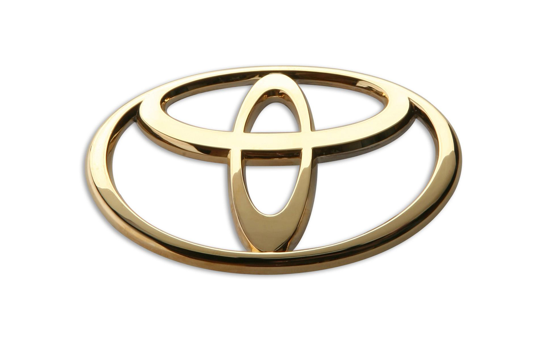
Toyota logo is known worldwide as a
combination of three ovals. The two overlapped inner ovals represent connection
between the hearts of the customers and the heart of the company as well as
mutually trusted relationship between them. Graphically they also symbolize ‘T’
for Toyota. The two ovals are embedded into a large ellipse that stands for
world embracing Toyota.
Shape of
the Toyota Symbol
Toyota emblem consists of three horizontally
symmetrical ellipses combined in a single configuration to bear the corporate
values. This symmetry makes the logo recognizable both from the front and when
seen through rear-view mirrors.
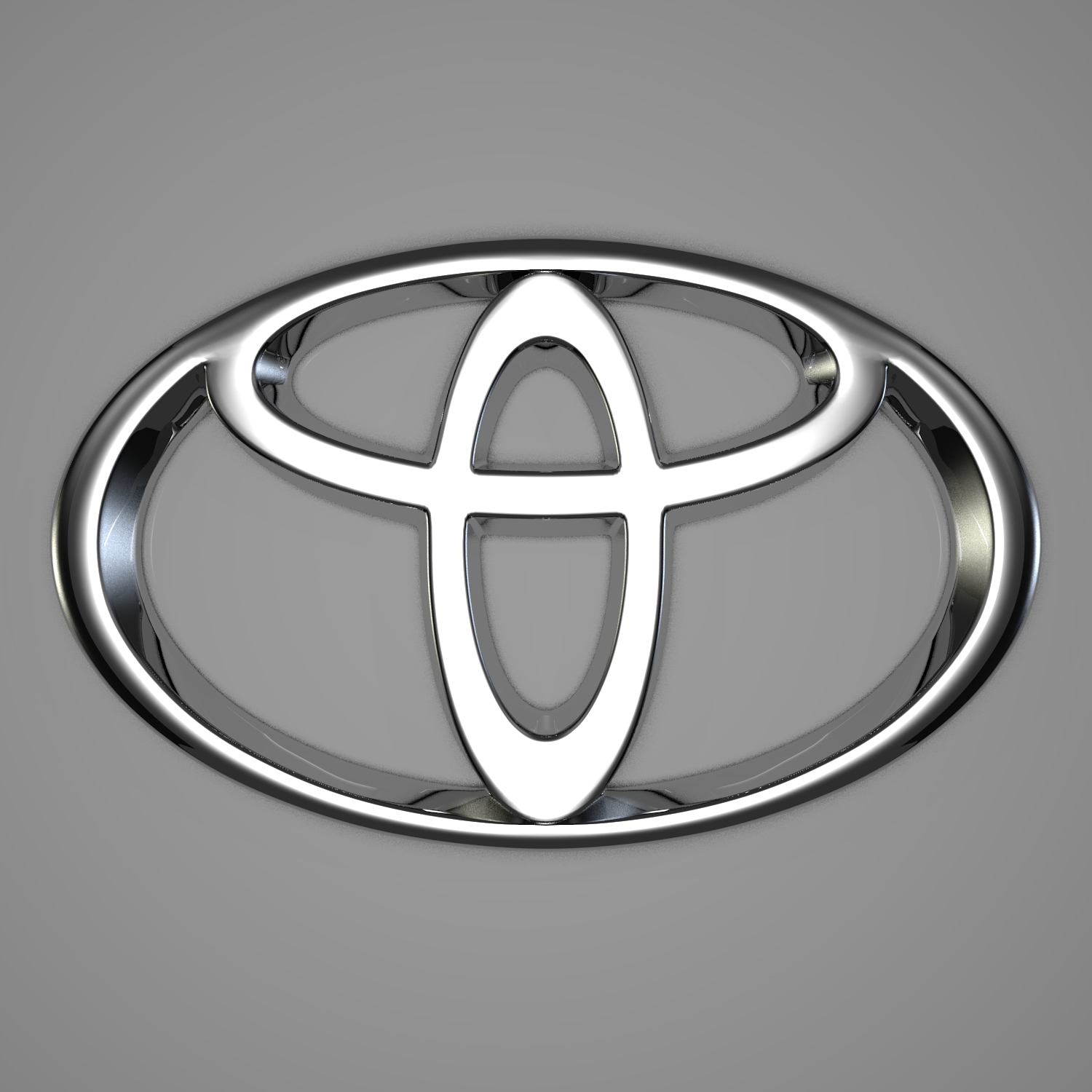
Colour of
the Toyota Logo
The corporate Toyota logo is designed in red
colour on white background, which is an attractive and eye-catching
combination. However, the logo seen on most Toyota cars is all silver, with
gradient shades. This is an elegant and modern option, typical for most car
manufacturers. The hybrid models feature the silver emblem placed on black font
with vivid blue shades.
No comments:
Post a Comment